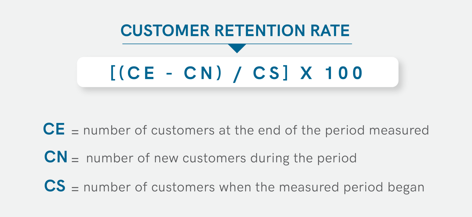
This is a continuation of my last publication A Data Analysis in business - BI system and visualization. In many publications on the Internet, you can find posts that there is little use from our metrics of user activity at different time intervals - on MAU, DAU, WAU. This is due to the fact that this “user activity” may not mean real user interest in our product. The growth of these metrics may be artificial and not reflect long-term engagement. This is due to the fact that there are various ways to attract a user (promotional promotions, bots, forced subscription, etc.). Here comes the second important question - how many users remain? This can be found out using the retention rate indicator.
There are two types of users in our news feed usage data: those who came through paid traffic source = ‘ads’, and those who came through organic channels source = ‘organic’. Our task is to analyze and compare the Retention of these two groups of users. This time we will build a graph - heat map. We also need to make a request to the database, the response to which will contain the date of the first use of our application by the user and how many days he had interest. The requests are of the same type, only the source changes. The selection of twenty days is connected with the fact that our schedule is visually readable.
SELECT toString(date) AS date,
        toString(start_date) AS start_date,
        countIf(user_id, source='organic') AS active_user_organic,
        countIf(user_id, source='ads') AS active_user_ads,
        (countIf(user_id, source='ads')/countIf(user_id, source='organic')) AS rate
FROM

(SELECT user_id, min(toDate(time)) AS start_date, any(source) as source
FROM simulator_20220620.feed_actions
GROUP BY user_id
HAVING start_date >= today()-20
) t1

JOIN

(SELECT DISTINCT user_id, toDate(time) AS date
FROM simulator_20220620.feed_actions) t2

USING user_id

GROUP BY date, start_date
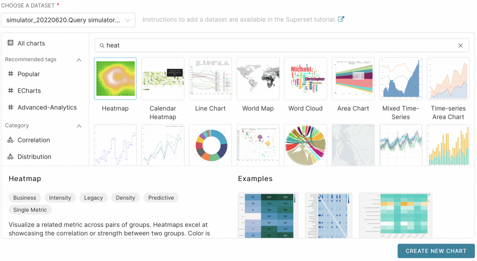
Next, select the graphs as we did in the last post and instead of the database, select our query and the heatmap graph type.
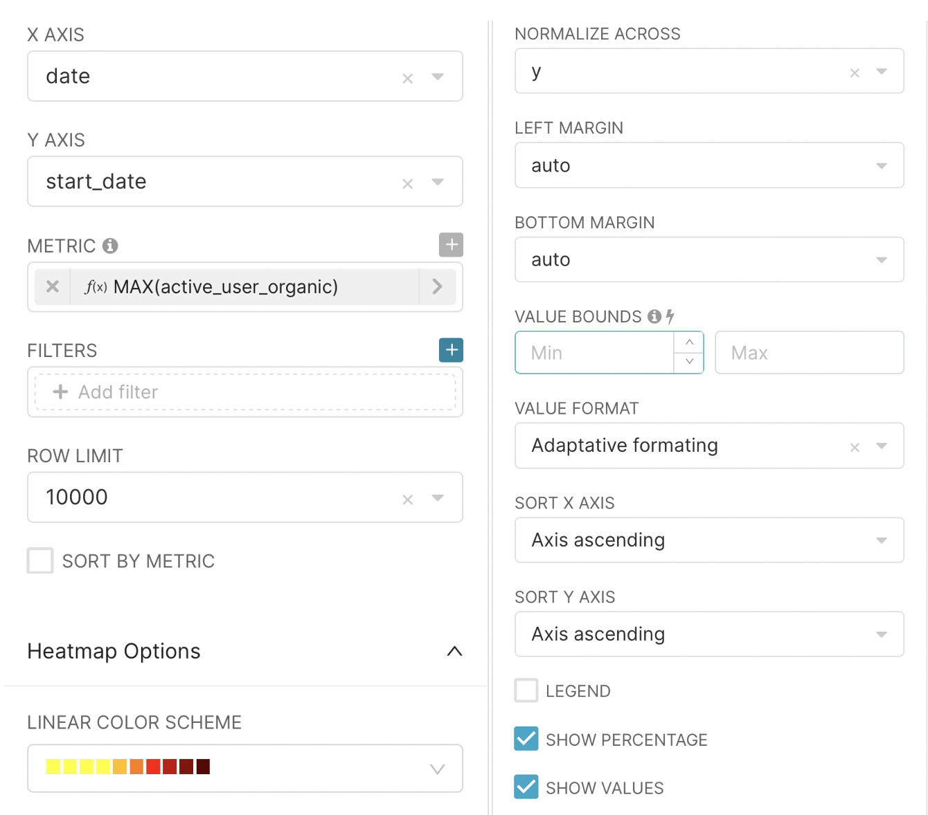
In the X AXIS field, select the date field, Y AXIS - start_data. In the METRIC field, since we just need to get a number, we can choose the MAX aggregation function (it does not affect anything in this case) and as the value of active_user_ads or active_user_organic, depending on which graph we want to build. Then you can change the color of the graph in the LINEAR COLOR SCHEME field. Also, in the NORMALIZE CROSS field, select that normalization will be on the y axis and do not forget to select SHOW VALUES .
After clicking on the RUN QUERY button, we get graphs on which we can analyze the outflow of our users.
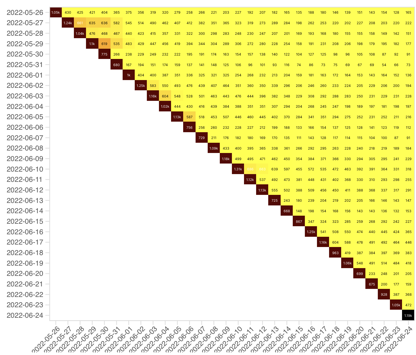
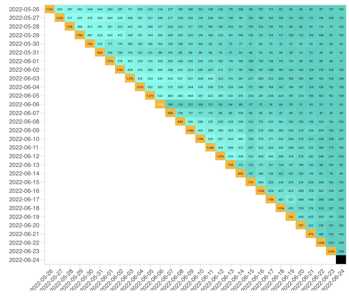
From the data obtained, it can be concluded that users who came through advertising lose interest in the application faster. There is sometimes a surge in their activity. But perhaps this is due to repeated advertising. The next stage, where our knowledge was required, was to analyze the quality of the advertising carried out by marketers in order to attract users. There was a clear surge of new users on the day of advertising, but it is unknown how long their interest remained. The promotion was held on June 06, 2022. At the first step, we will create a query to our database and get data on users who registered on that day.
SELECT
  data,
  countIf(user_id, source='ads') AS count_user_ads,
  countIf(user_id, source='organic') AS count_user_organic
FROM

(SELECT user_id, min(toDate(time)) AS start_data, source
FROM simulator_20220620.feed_actions
GROUP BY user_id, source
HAVING min(toDate(time)) = '2022-06-06') t1

JOIN

(SELECT DISTINCT user_id, toDate(time) as data
FROM simulator_20220620.feed_actions) t2

USING user_id

GROUP BY data, source

ORDER BY data
Next, we select our query as a data source and the type of chart - bar chart. In metrics, we again select the MAX function separately for the count_user_ads and count_user_organic columns. After that, we rename them in order to visually look more aesthetically pleasing.
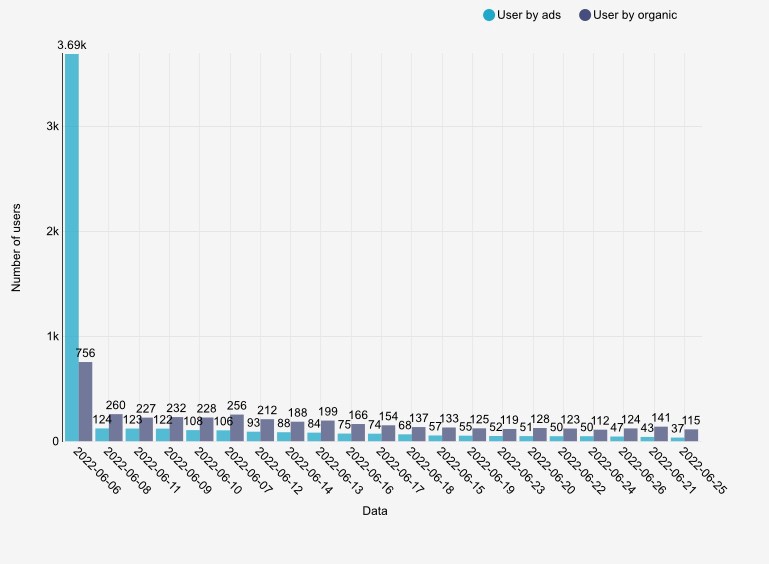
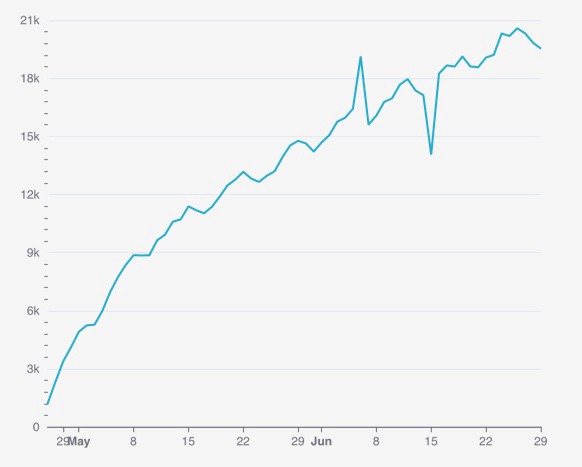
On June 06, 2022, there was a surge in attracted users as well, but the next day there was a sharp decline in both groups. At the same time, it is important to note that the number of advertising users is decreasing daily, while ordinary users, having fallen to an average value, are kept at the same level. We can say that the advertising campaign failed. Then on June 15 there was a sharp drop in the active audience and we were instructed to deal with the cause of the fall.
I have plotted the distribution of the active audience depending on gender and operating system
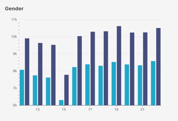
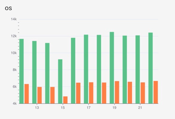
As can be seen from the graphs obtained, the fall occurred proportionally in both categories, from which it was concluded that these characteristics are not the cause of the fall. Then I moved on to the analysis separately by country. Since there are significantly more users in Russia than in other countries, I put it on a separate chart.
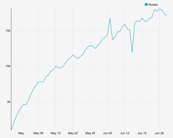
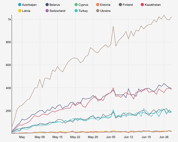
From these graphs, it can already be concluded that a significant drop in active users is due to Russia. Let’s go deeper and get a sample by city. The visual representation will not give us the necessary information. Therefore, we will output the result to the table using an SQL query.
SELECT city,
      uniqIf(user_id, toDate(time) ='2022-06-14' ) as day_0,
      uniqIf(user_id, toDate(time) ='2022-06-15') as day_1,
      uniqIf(user_id, toDate(time) ='2022-06-16') as day_2,
      day_0 - day_1 as diff_1,
      day_2 - day_1 as diff_2
FROM simulator_20220620.feed_actions
WHERE country = 'Russia'
GROUP BY city
ORDER BY diff_1 DESC,  day_0 DESC
As a result , we get the following table:
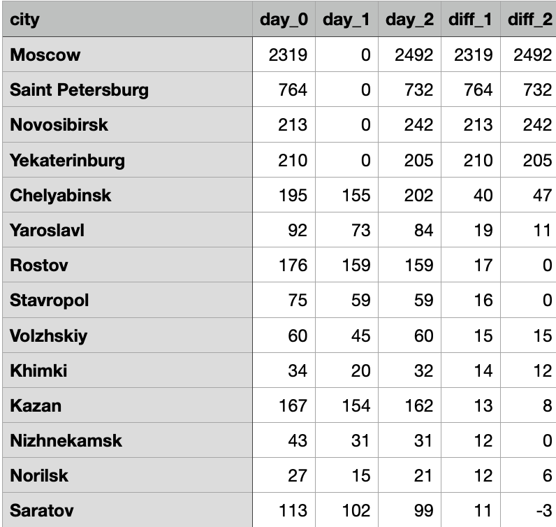
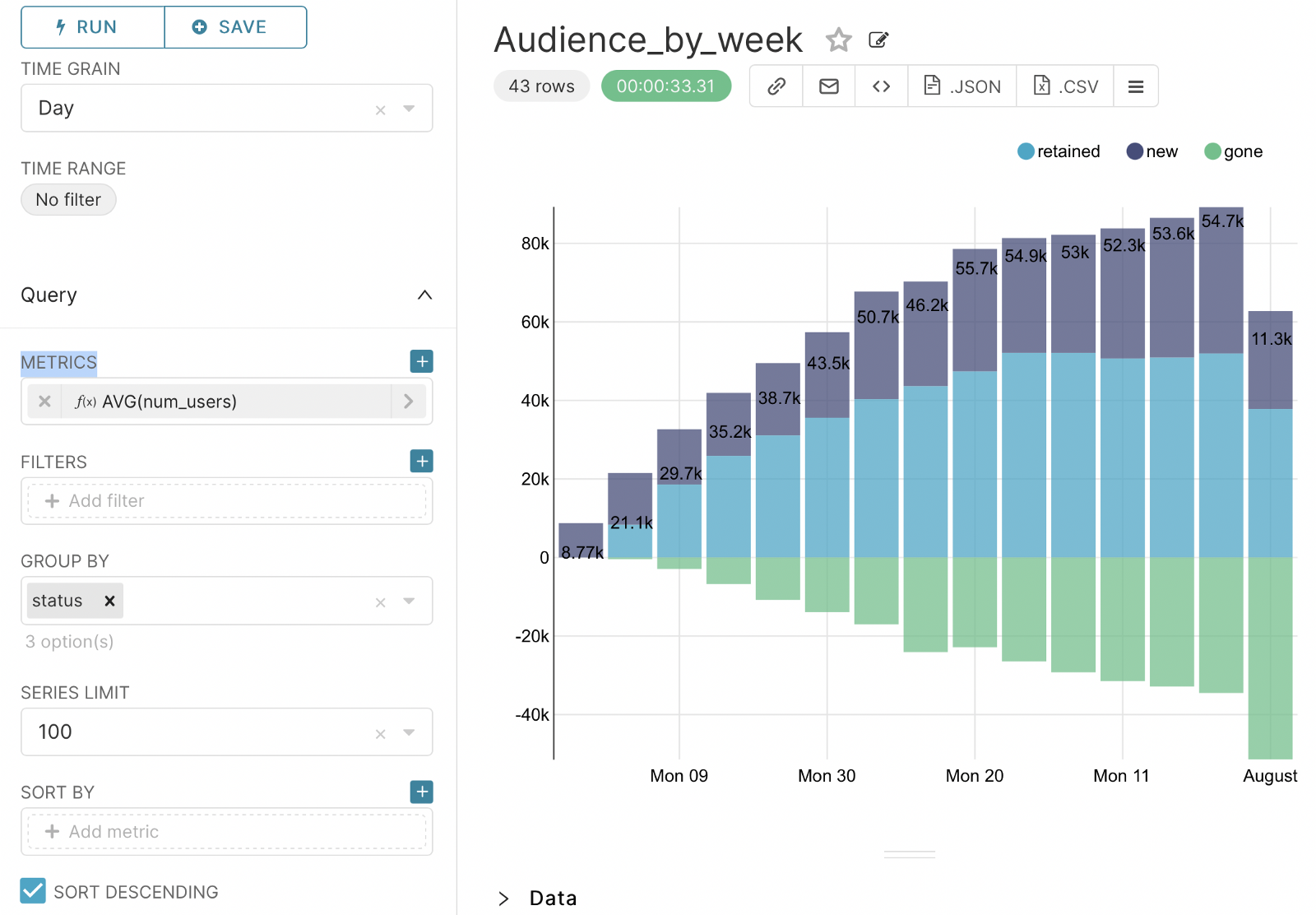
From it it becomes clear to us that the drop on this day is due to the lack of active users from large cities. Then this data can be transferred to the technical department or the department of attracting and retaining customers. The last step is to create a graph that shows an active audience from the point of view of new, old and departed users:
- New - the first activity in the feed was this week.
- The old ones - there was activity both this week and last week.
- Gone - the activity was last week, this was not.
To do this, create the following query to the database:
SELECT this_week, previous_week, -uniq(user_id) as num_users, status FROM

(SELECT user_id,
groupUniqArray(toMonday(toDate(time))) as weeks_visited,
addWeeks(arrayJoin(weeks_visited), +1) this_week,
if(has(weeks_visited, this_week) = 1, 'retained', 'gone') as status,
addWeeks(this_week, -1) as previous_week
FROM simulator_20220620.feed_actions
group by user_id)

where status = 'gone'

group by this_week, previous_week, status

HAVING this_week != addWeeks(toMonday(today()), +1)

union all


SELECT this_week, previous_week, toInt64(uniq(user_id)) as num_users, status FROM

(SELECT user_id,
groupUniqArray(toMonday(toDate(time))) as weeks_visited,
arrayJoin(weeks_visited) this_week,
if(has(weeks_visited, addWeeks(this_week, -1)) = 1, 'retained', 'new') as status,
addWeeks(this_week, -1) as previous_week
FROM simulator_20220620.feed_actions
group by user_id)

group by this_week, previous_week, status
To build a chart, select VISUALIZATION TYPE - Time-series Bar Chart. In TIMECOLUMN we will choose this_week, and in TIMEGRAIN - Day. As a metric, we choose the aggregating function - AVG by num_users and group it by status. And as a result, we will have the following graph:
This concludes the article on Analyses of Product Metrics. The next article will be devoted to A/B testing.