I worked for a long time in large enterprises, in medicine and science in the roles of Data Analyst and Data Science. In February I had to leave the country I was living in, and I started looking for jobs as a Data Analyst or Data Science in various companies. But I faced the problem that even after completing test tasks, I was rejected with the wording that I had no commercial experience. After that I decided to take an internship - courses to understand the difference between the statistics I used and the ones used by other companies. It turned out that there were no differences. But I decided to share with you my projects, which I performed on these courses-internship. Maybe they will help someone not to get confused and understand where to start in the new place of work.
Of the tools we used, we used the following:
- ClickHouse - a column database for storing user events;
- Redash - a tool for writing SQL queries and basic visualization;
- Superset - a complete BI system;
- Jupyter Lab - an environment for writing code in Python;
- GitLab - a repository for storing code;
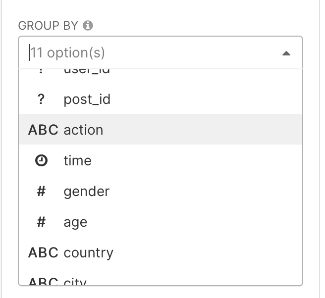
- Airflow - a tool for automating work tasks and launching them according to the schedule. We were given a database with two tables: feed_actions and message_actions. As it is clear from their names - the first one contained information about users (columns - user_id, post_id, action, time, gender, age, country, city, os, source, exp_group ), and the second - about user interaction (columns - user_id, reciever_id, time, source, exp_group, gender, age, country, city, os).
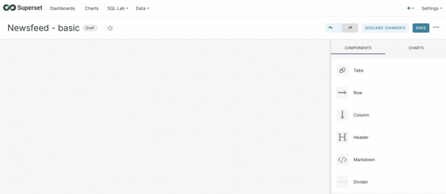
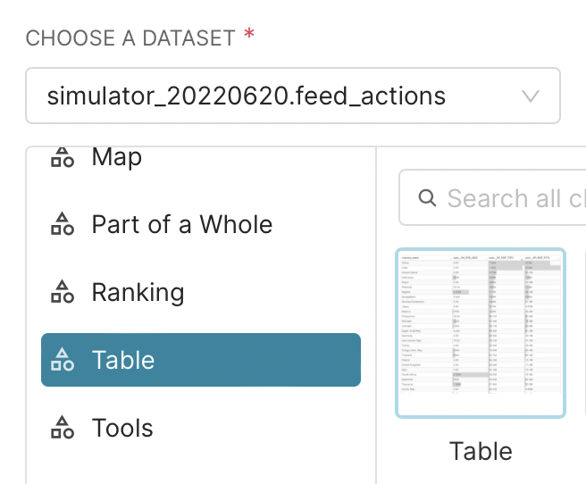
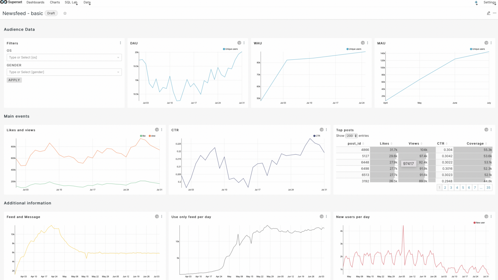
Our first step is to create dashboards, from which we can already visually do the first analysis of our data and present it to our colleagues. As I showed above, we did it in Superset, but you can easily adapt it to other BI systems.
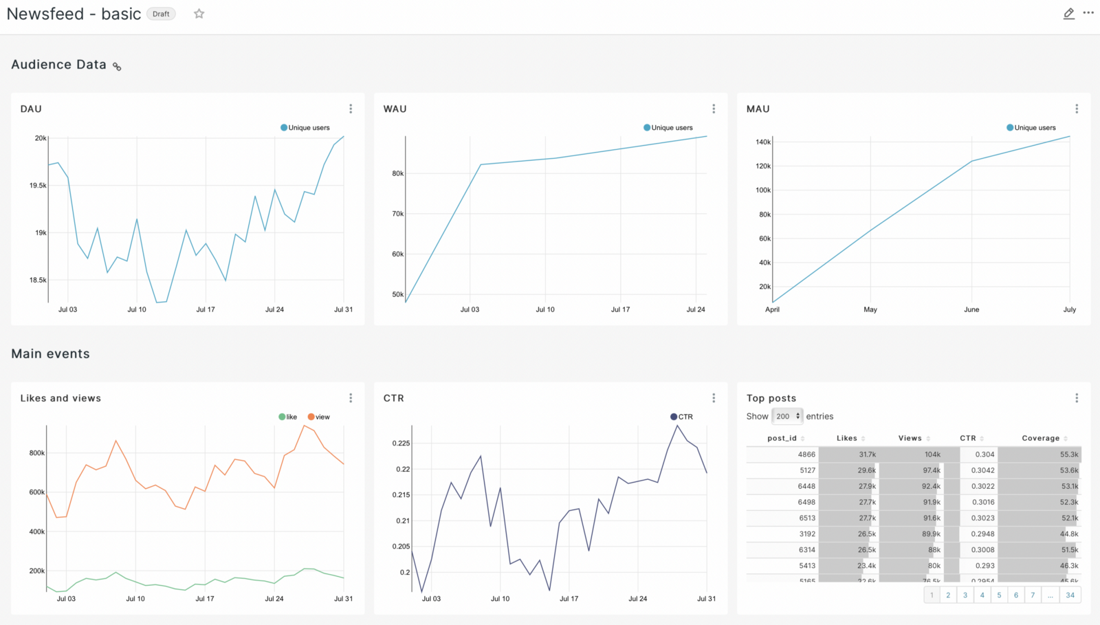
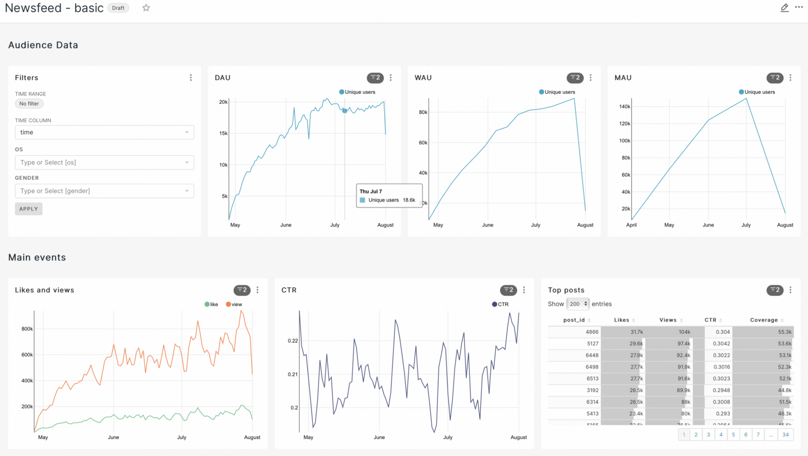
The first dashboard will be called Newsfeed - basic.
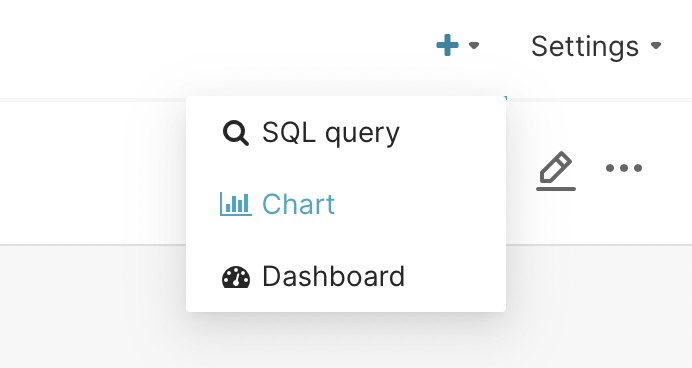
We will start to fill it with graphs. So click on the plus sign in the upper right corner and you will see a menu. From it select the chart.
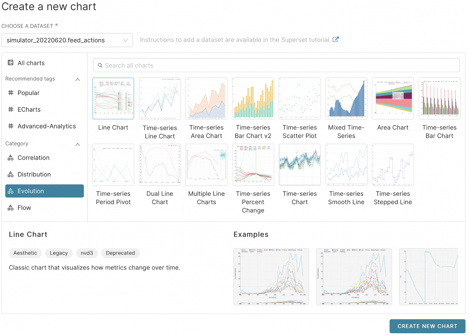
Next, go to the window where we need to select the table for analysis and type of chart. Usually for the analyst it is necessary to study the changes in the data over time. As they said in the lectures - it’s important for the analyst to answer the first question - ”How much?” To do this, you can use metrics of user activity for a specific period: per day (daily active users - DAU), per week (weekly active users - WAU) or per month (monthly active users - MAU). That’s why we choose: Evolution - Line Chart and click in the lower right corner create new chart.
After that, we get to the window of work with the schedule, which is typical for many BI systems:
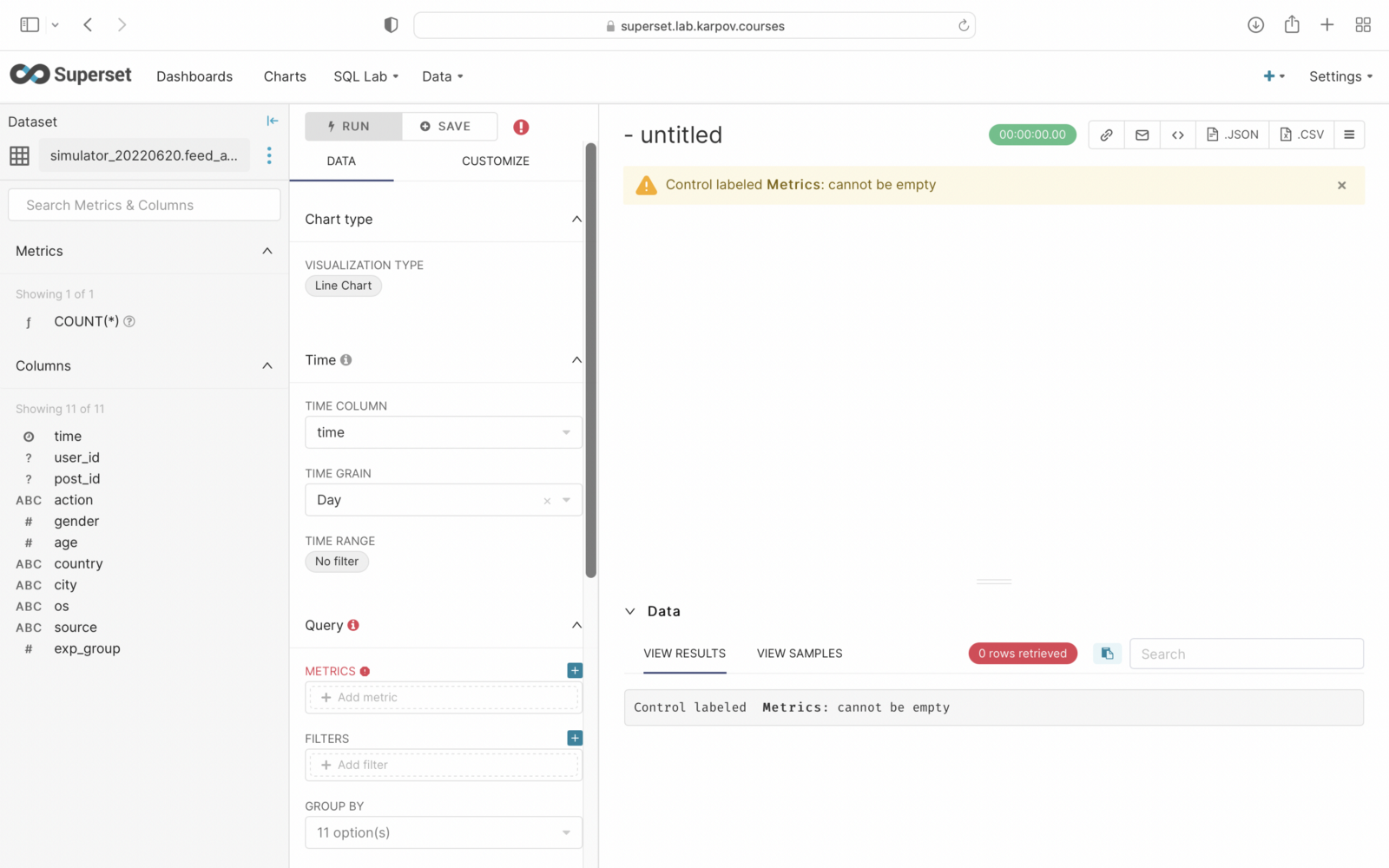
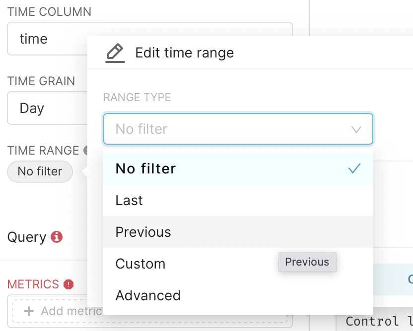
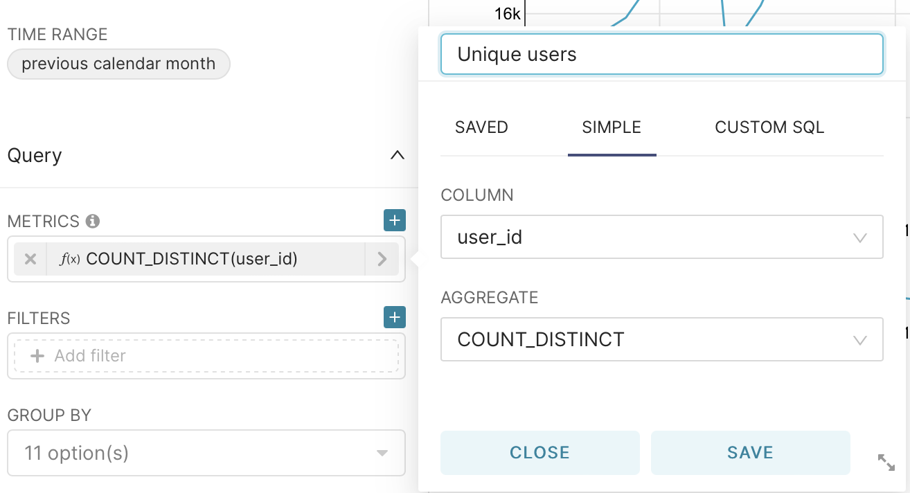
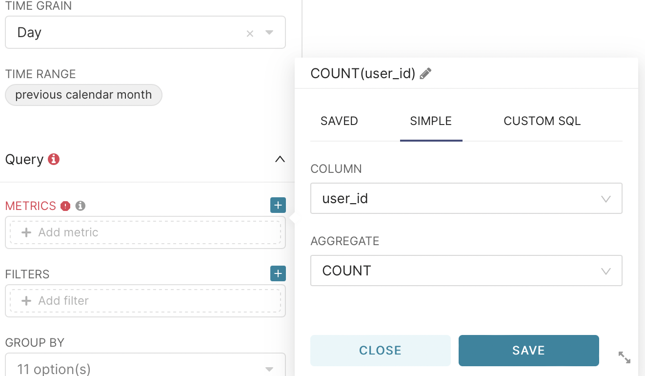
In the Time range floor we click on no filter. We choose the previous.
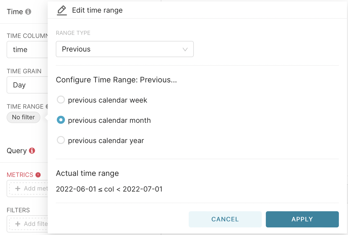
In the second step, we select the previous month and press apply.
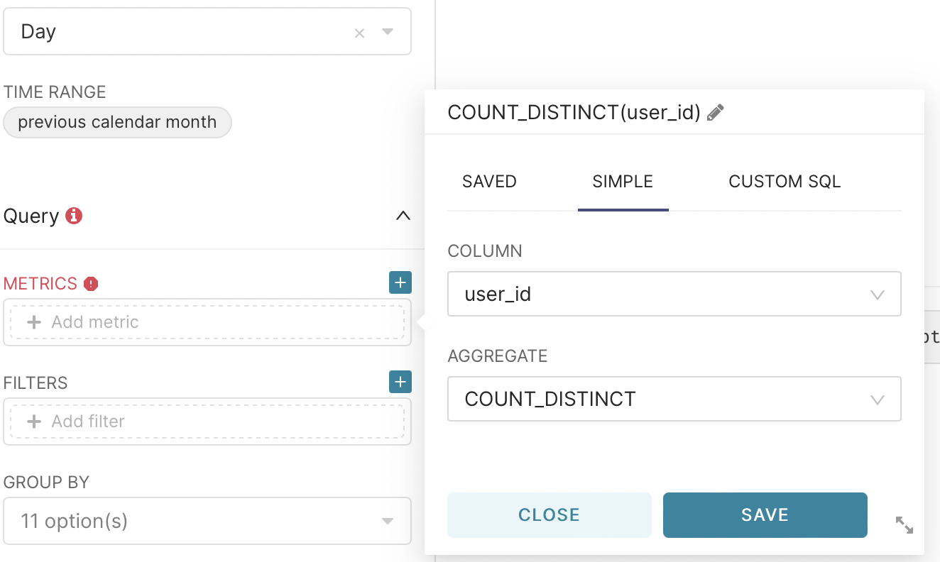
To calculate, go to the metrics field, go to the simple tab, select the user_id column and for count_dictinct and click save.
After that in the big window we press run query. As a result, we get the first graph.
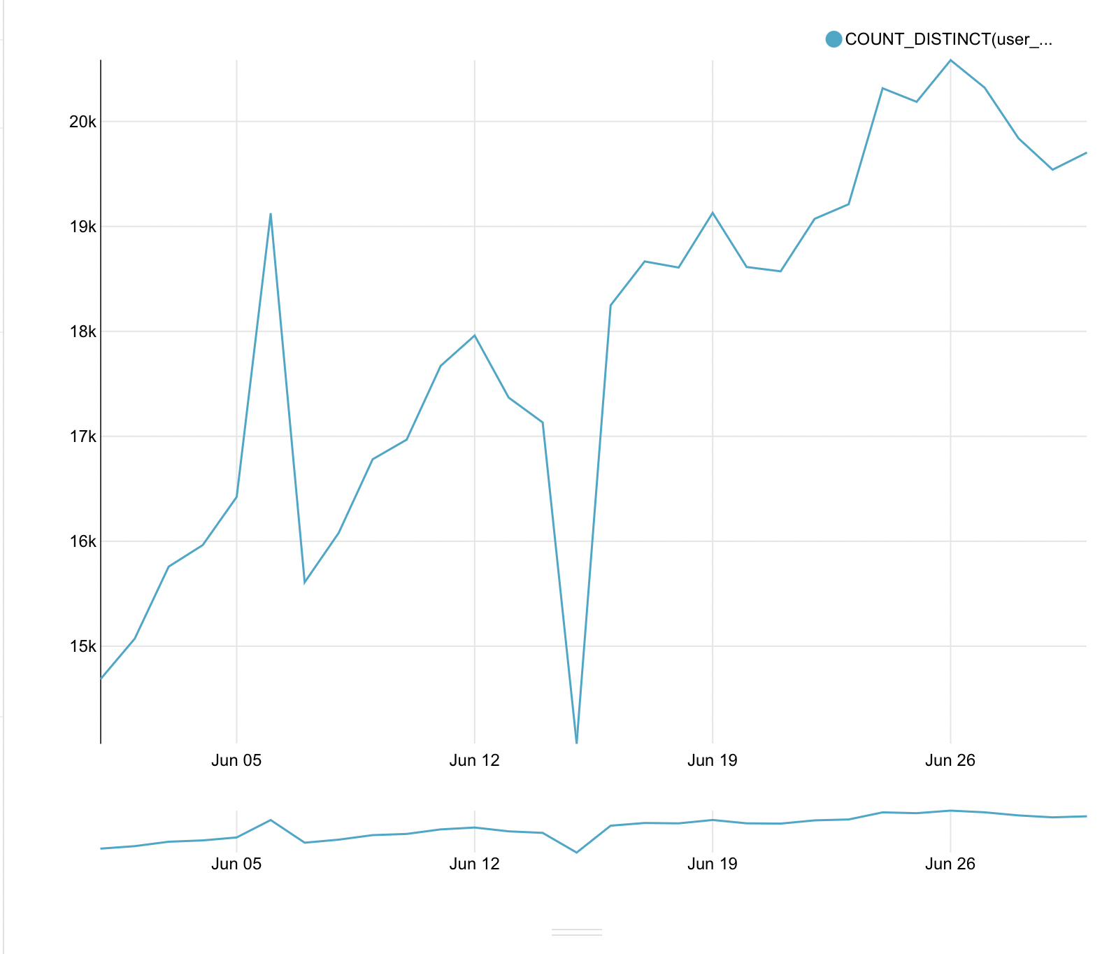
After a little edit the name of the legend again by going to the metric and clicking on the pencil. Let’s call our data - unique users.
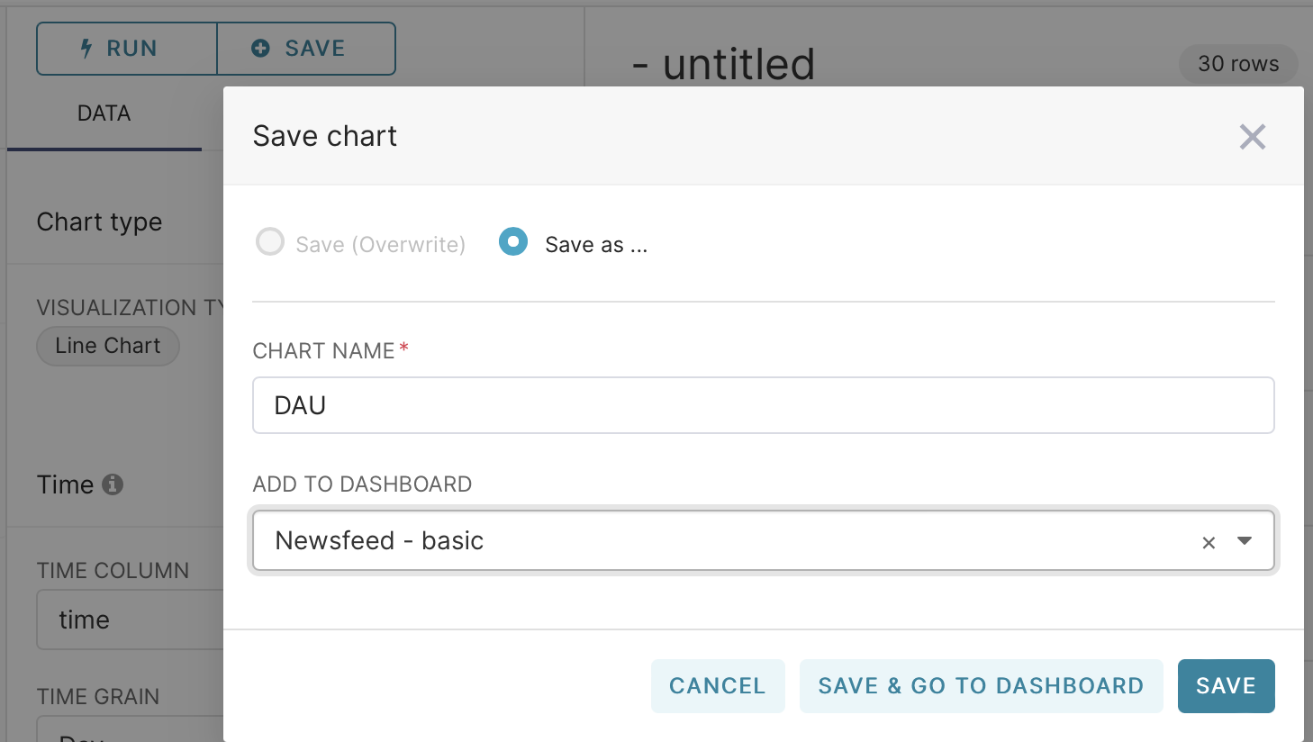
Next, save our graph to the dashboard by clicking save and entering the name of the graph and the dashboard where you want to save it.
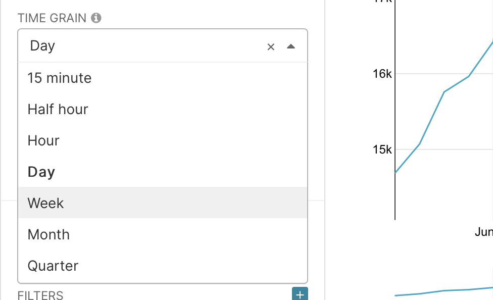
Now you can either repeat all the previous steps or in the same graph in the time green field change the period to weeks. Now we will get the number of unique users by weeks.
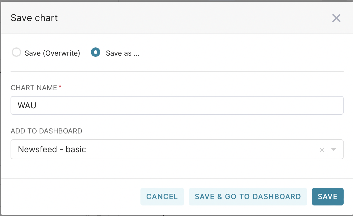
Now, when saving, select Save as and name our graph as WAU
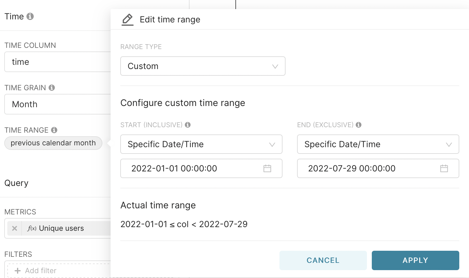
With the monthly schedule, you must explicitly set the time interval. This is done by selecting Range Type - Custom and Start - Specific Data/Time. After that, select the date.
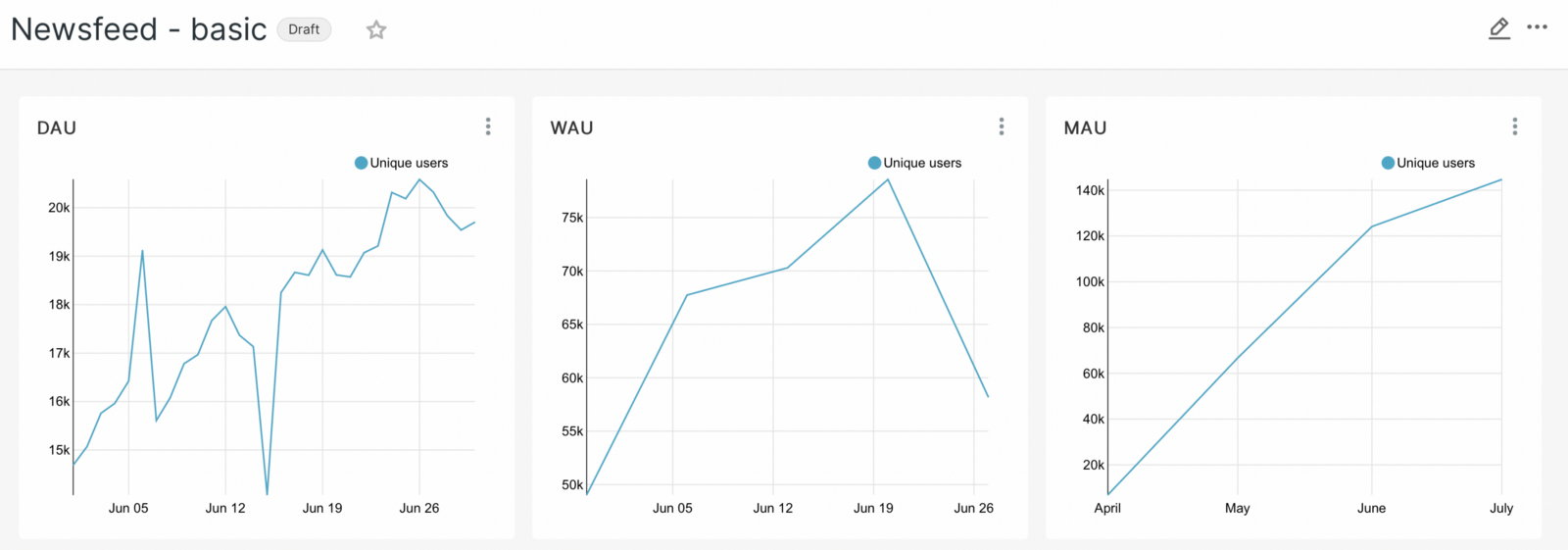
We also save the graph on the dashboard as a MAU. Now we have three graphs on our dashboard.
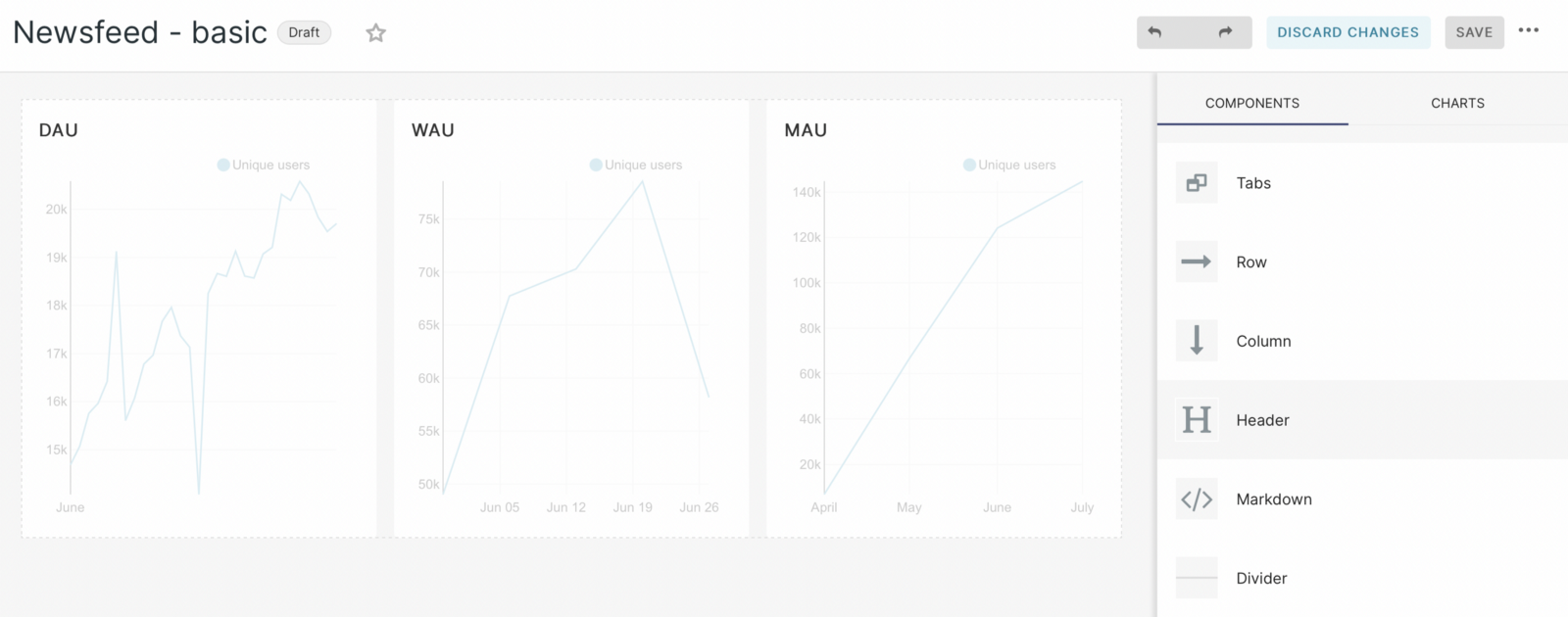
In the dashboard itself, we’ll add a subheading, Audience Data, which will allow our data not to get mixed up.
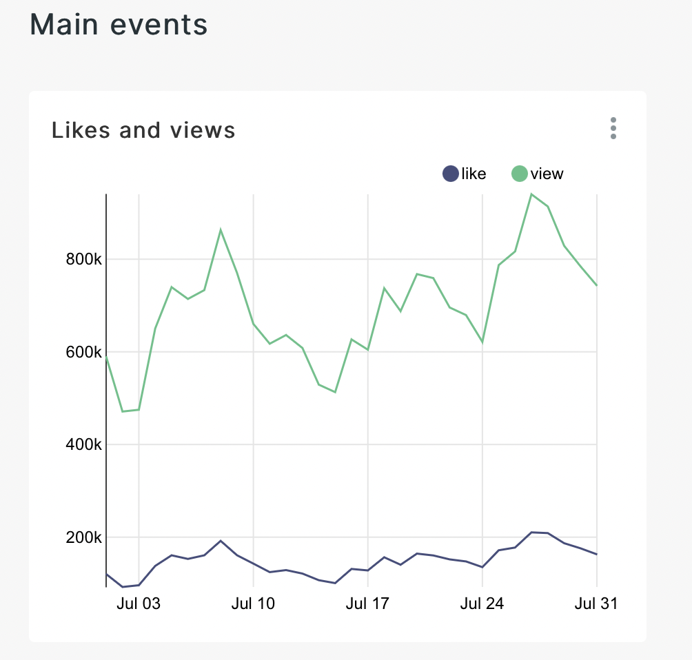
With the help of these graphs we have answered the first question - ”how much? Now, since our users are interacting, we can go deeper and look at the target metrics. Let’s do the same steps as before, choose the same linear graph. But now the construction method itself will be different. We will consider the development of the previous month. Let’s select the user_id field again, but now we will do it with count instead of count_distinct.
And in the group by field select the action column
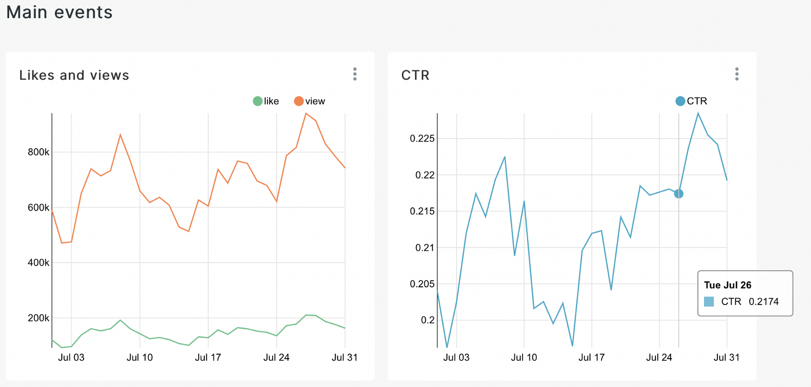
As a result, we get a graph on which the seasonality is already visually noticeable and we can draw initial conclusions from it. Let’s save it, as well as the previous graphs, to our dashboard. Let’s add a separator on the dashboard using the header - the main events.
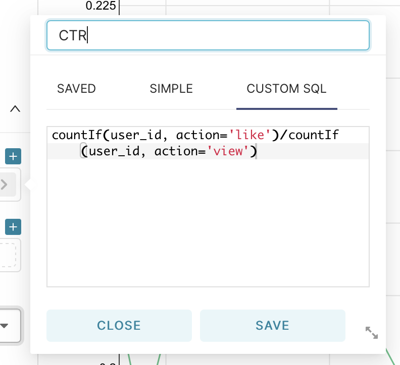
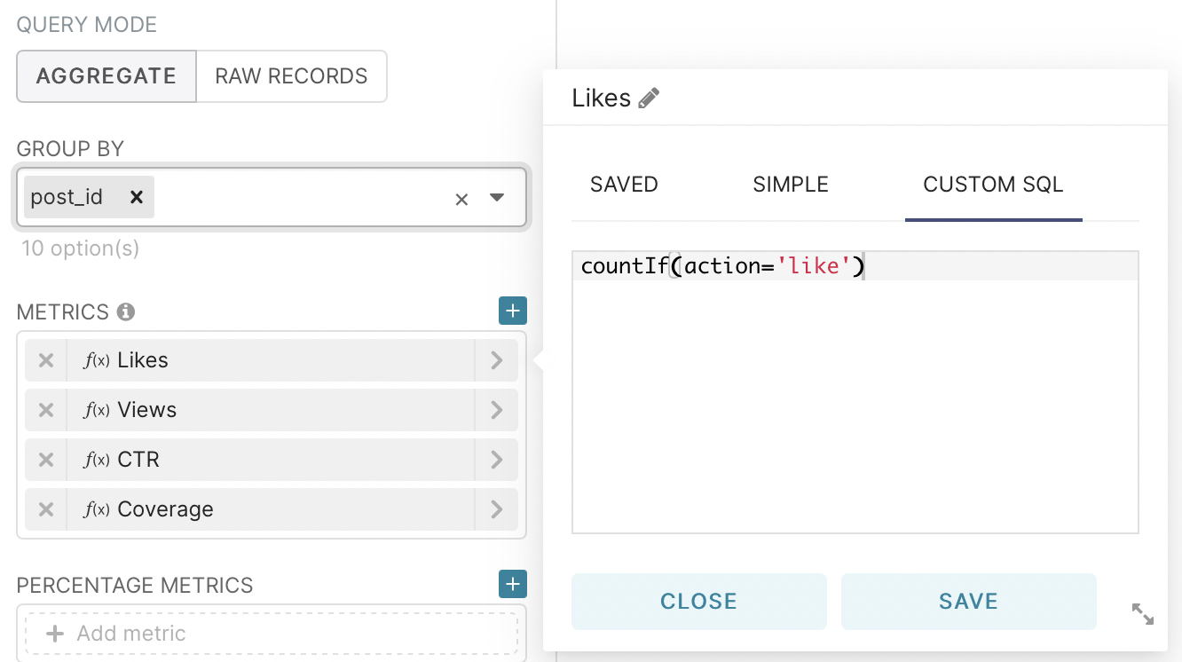
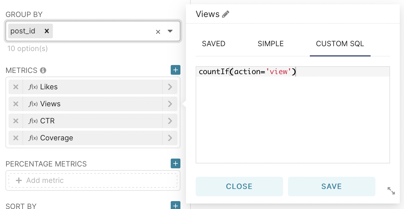
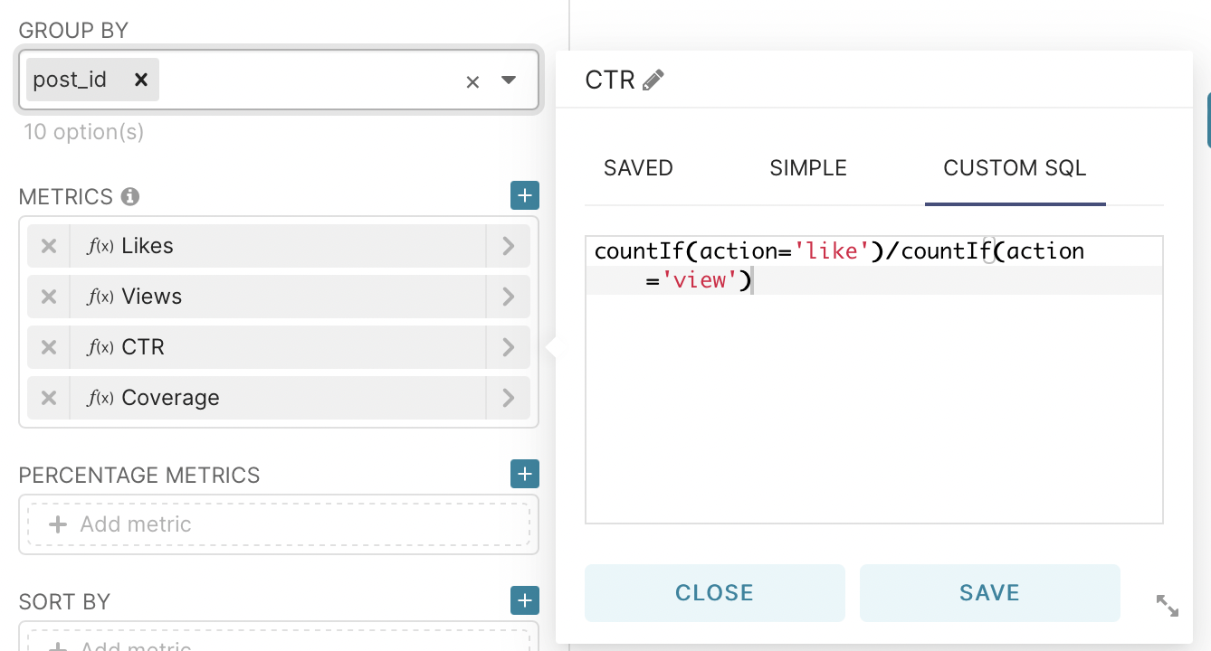
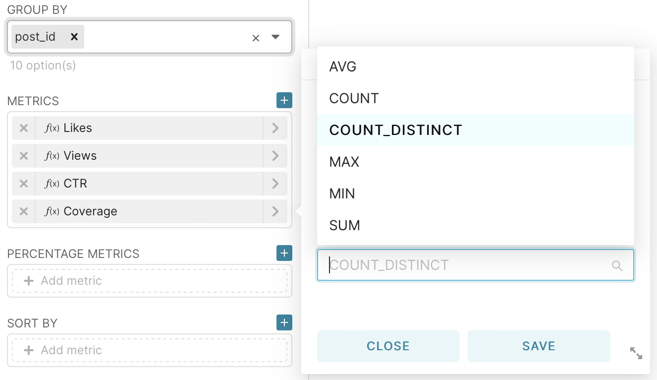
Next, let’s move on to the construction of one of the main metrics - CTR. This is the primary metric that demonstrates the ratio of ad impressions to clicks on it. From the group by field delete all the values for grouping, and in the metrics field go to the tab custom sql and enter the code shown in the picture.
Then we save the resulting graph to our dashboard.
Now let’s make a chart on the top views. To do this, go to charts, but now select table - table.
After that, we will add three metrics using custom SQL and one using a standard function:
We can say that we have taken the first step in the work of the analyst and now we can present information that can be visually evaluated by every specialist, regardless of direction.
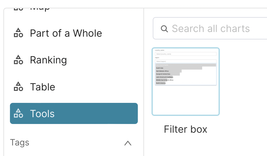
In order to make it easier to use the resulting graphs, let’s add a filter. It will allow, if we need private statistics, not to go to each graph to make adjustments, but to perform this action directly on the dashboard.
As usual, go to chart and select Tools - Filter Box.
In the filters field, let’s select the type of operating system and the gender of our users as an example.
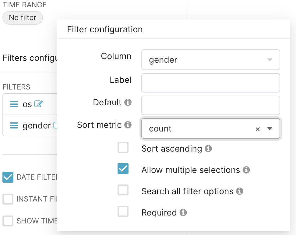
And also select the possibility of selecting a time interval on the filter.
Then we save the resulting filter to the dashboard and rearrange the graphs in the way that looks best to us visually. I got the following result as an example:
We can say that we got the basic graphs by which we can visually evaluate our application on a daily basis. But this seemed to me not enough and I decided to add some more graphs. But to build them, I had to create sql queries to the database to get the required characteristics.
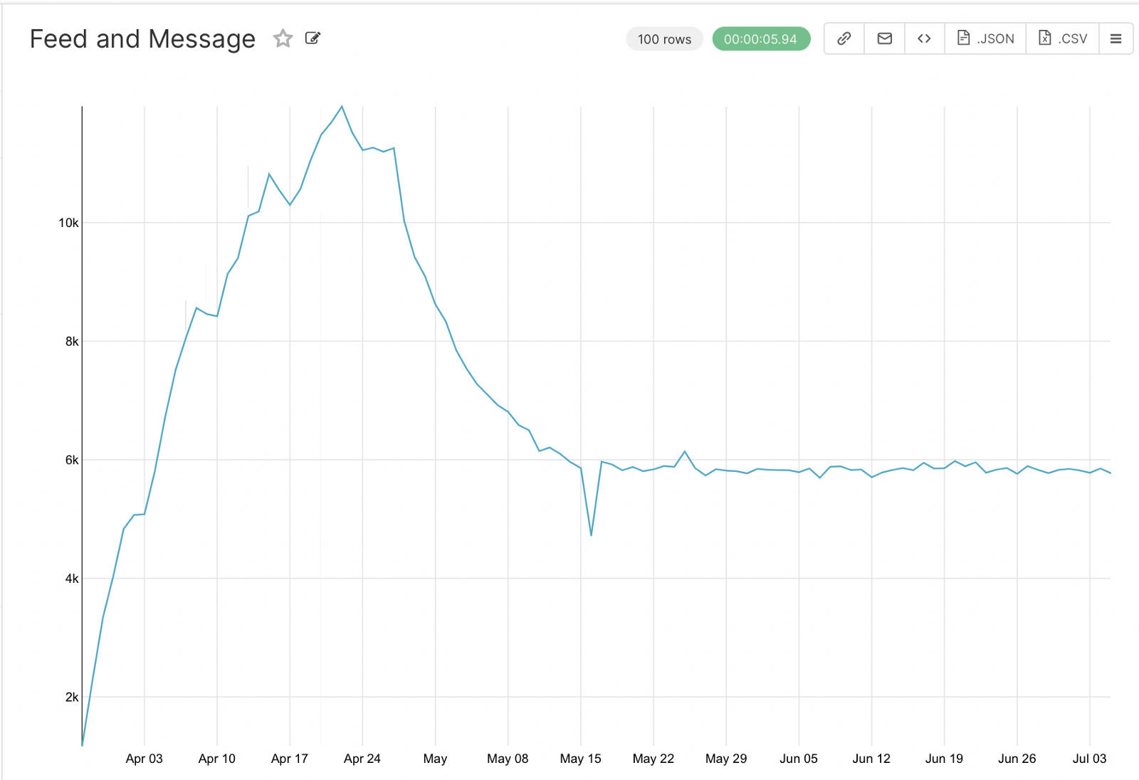
The first step is to make a graph that shows the number of users using the news feed and exchanging messages. To do this, we need to merge the two databases and count the unique ones for each day.
SELECT  user_id,  time
FROM simulator_20220520.feed_actions AS a
JOIN simulator_20220520.message_actions AS b ON a.user_id = b.user_id
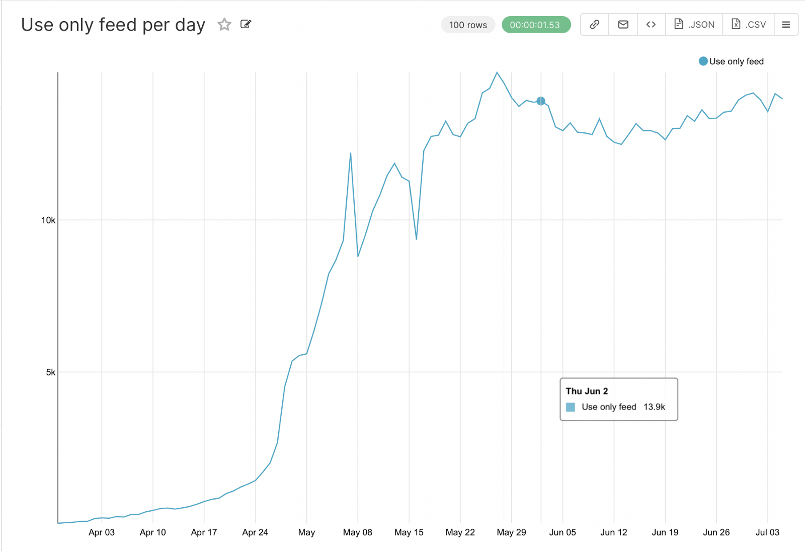
The next step, respectively, is to graph the users who only use the newsfeed.
SELECT  *
FROM simulator_20220520.feed_actions AS a
WHERE user_id NOT IN (SELECT user_id FROM simulator_20220520.message_actions AS b)
And the last step is to highlight the number of new users each day. Here you need to get the first date for each user in the sql query when you create the query, which will allow you to count the new users for individual days.
SELECT user_id, date_trunc('day', MIN(time)::DATE) AS start_time
FROM simulator_20220620.feed_actions
GROUP BY user_id
ORDER BY 1, 2
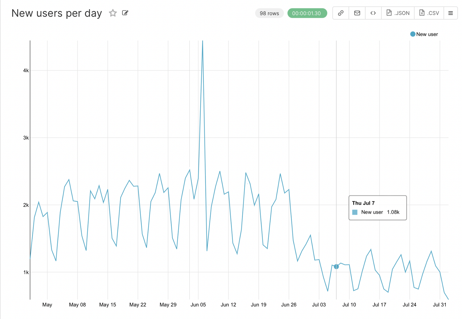
As a result, we got a dashboard that can be used by any specialist in our companies and conduct visual analysis. From the graphs you can already make conclusions about the presence of seasonality, ups and downs, which will need to be more detailed, which we will do as an example in the next article.
This concludes the first part, the rest will be in the next publications.